


Huel Website Breakdown: The Funnel That Turned Complete Nutrition Into a 4-Million-Customer Machine
The Brand Behind the Funnel
Huel, the UK-founded complete nutrition brand, has quietly built one of the most sophisticated DTC funnels in the food and supplement space. Founded in 2015 by Julian Hearn, Huel (a portmanteau of Human + Fuel) sells nutritionally complete meals – powders, ready-to-drink shakes, hot meals, greens, energy drinks, and protein bars – designed to deliver all 27 essential vitamins and minerals in every serving. The brand has served over 4 million customers globally and operates across the US, UK, and EU markets.
What makes Huel’s marketing strategy worth deconstructing is not just scale – it’s the architectural sophistication underneath. Huel runs a headless Shopify storefront built on Next.js and hosted on Vercel, giving them full control over a frontend experience that most Shopify brands can only approximate with themes. Their product range spans 15+ SKUs across six categories, yet the site manages to guide both first-time visitors and returning subscribers through purchase paths that feel simple rather than overwhelming.
What We Analyzed
We went through Huel’s entire website funnel across both desktop and mobile – homepage, product pages (Black Edition powder, Discovery Bundle), collection pages (Bundles, All Products), navigation architecture (mega menus, mobile hamburger menu, Science and About dropdowns), the full cart and checkout flow (add to cart, slide-out cart drawer, cross-sells, subscription management), and below-the-fold content including email capture, social proof, and footer structure. We also extracted the site’s source code to evaluate structured data, meta tags, tech stack, and schema markup for SEO and AI discoverability.
Key Findings
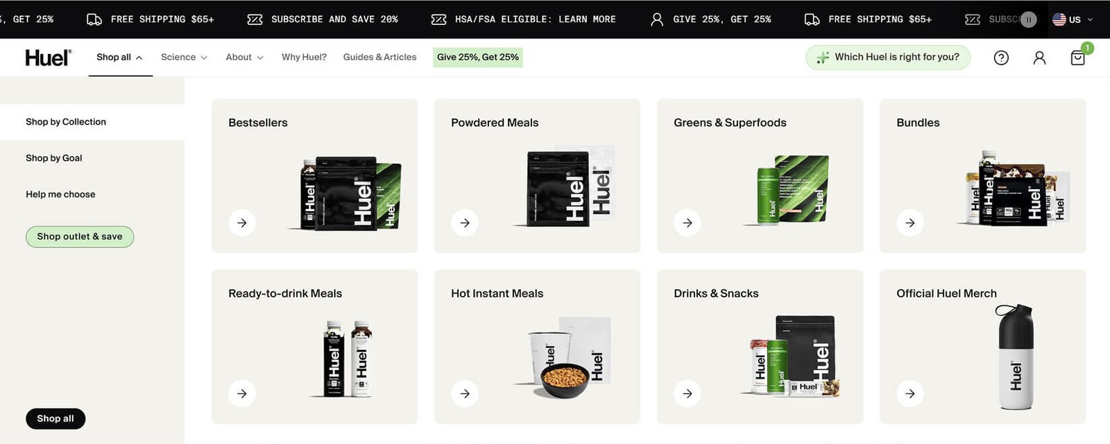
- Huel’s dual-mode navigation – toggle between “Shop by Collection” and “Shop by Goal” – is one of the most sophisticated information architecture patterns we’ve seen in DTC. It serves returning customers who know the product type and new visitors who only know their problem (lose weight, more protein), all from the same menu.
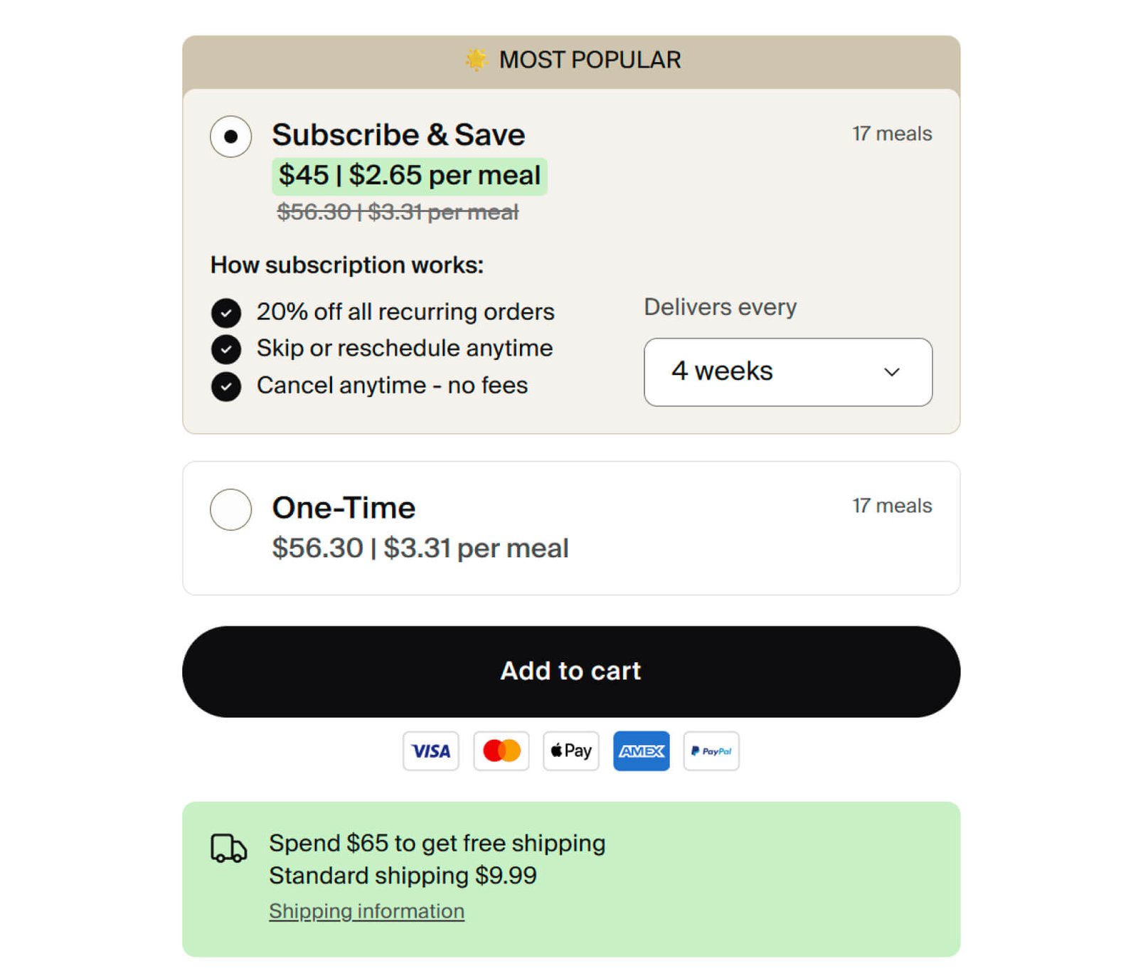
- The subscription-first product page architecture is a masterclass in nudge design. The subscribe option is pre-selected, badged as “MOST POPULAR,” shows a 20% savings comparison, and addresses the three biggest subscription objections (cost, flexibility, commitment) in three bullet points directly below the toggle.
- Huel’s cart drawer is doing more conversion work than most brands’ entire checkout flows. A dual-threshold progress bar (free shipping at $65, 10% discount at $120), short-dated stock cross-sells at 45% off, subscription add-ons, a free $40 Welcome Kit visualization, and Huel+ loyalty points – all within a slide-out panel.
- The site runs comprehensive structured data – Organization schema with founder and social links, ProductGroup with 12 variants, FAQPage with 9 customer questions, and BreadcrumbList – making it one of the better-optimized DTC sites for both Google rich snippets and AI assistant citation.
- Despite the overall quality, Huel has notable technical SEO issues: duplicate H1 tags and H2s across pages (a Next.js rendering artifact), duplicate WebSite schema, missing og:image on the homepage, and no visible search function on mobile – problems that are fixable but currently eroding discoverability.
First Impressions: How Huel Builds Trust Before the Scroll
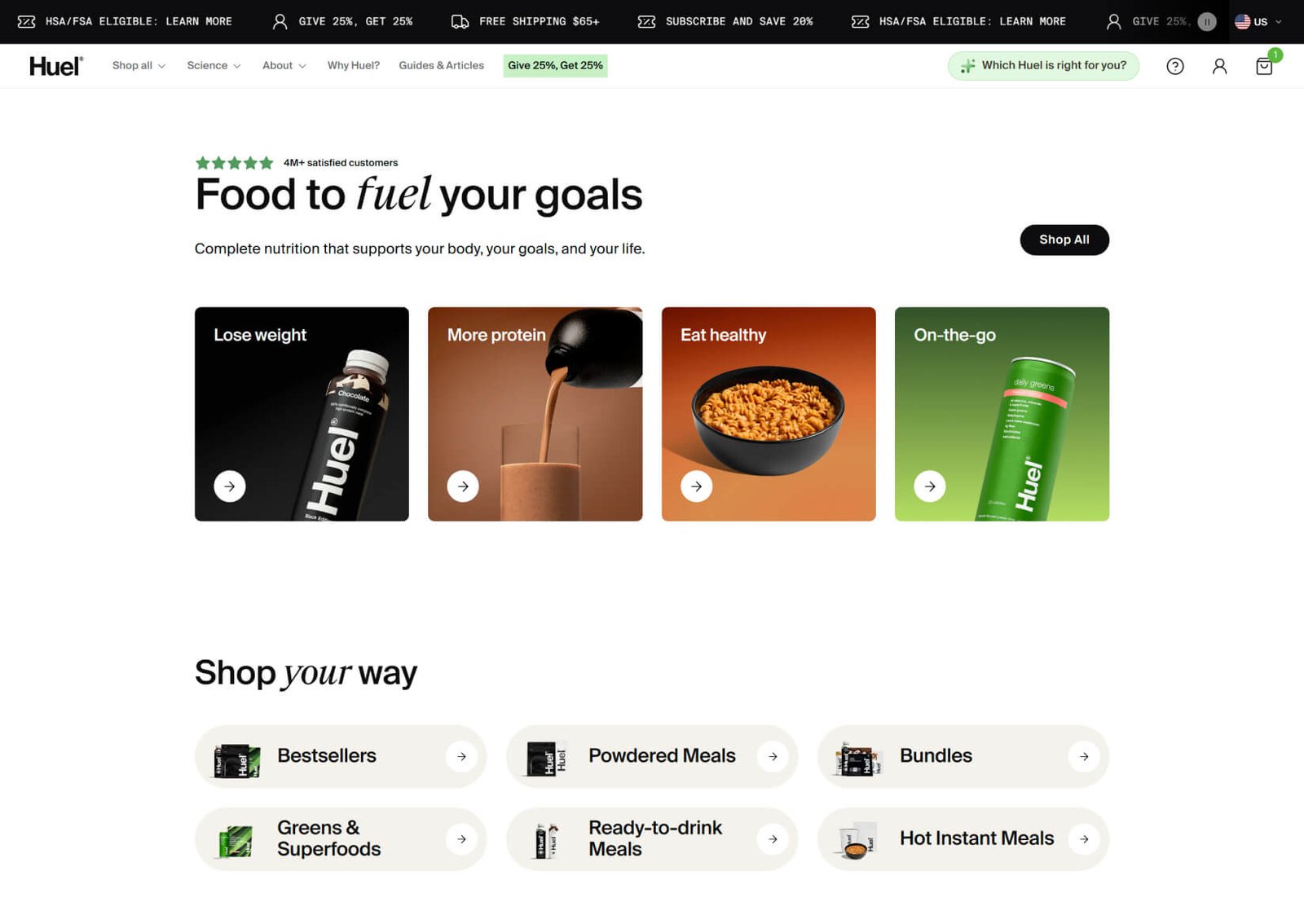
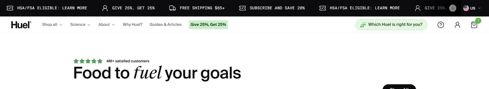
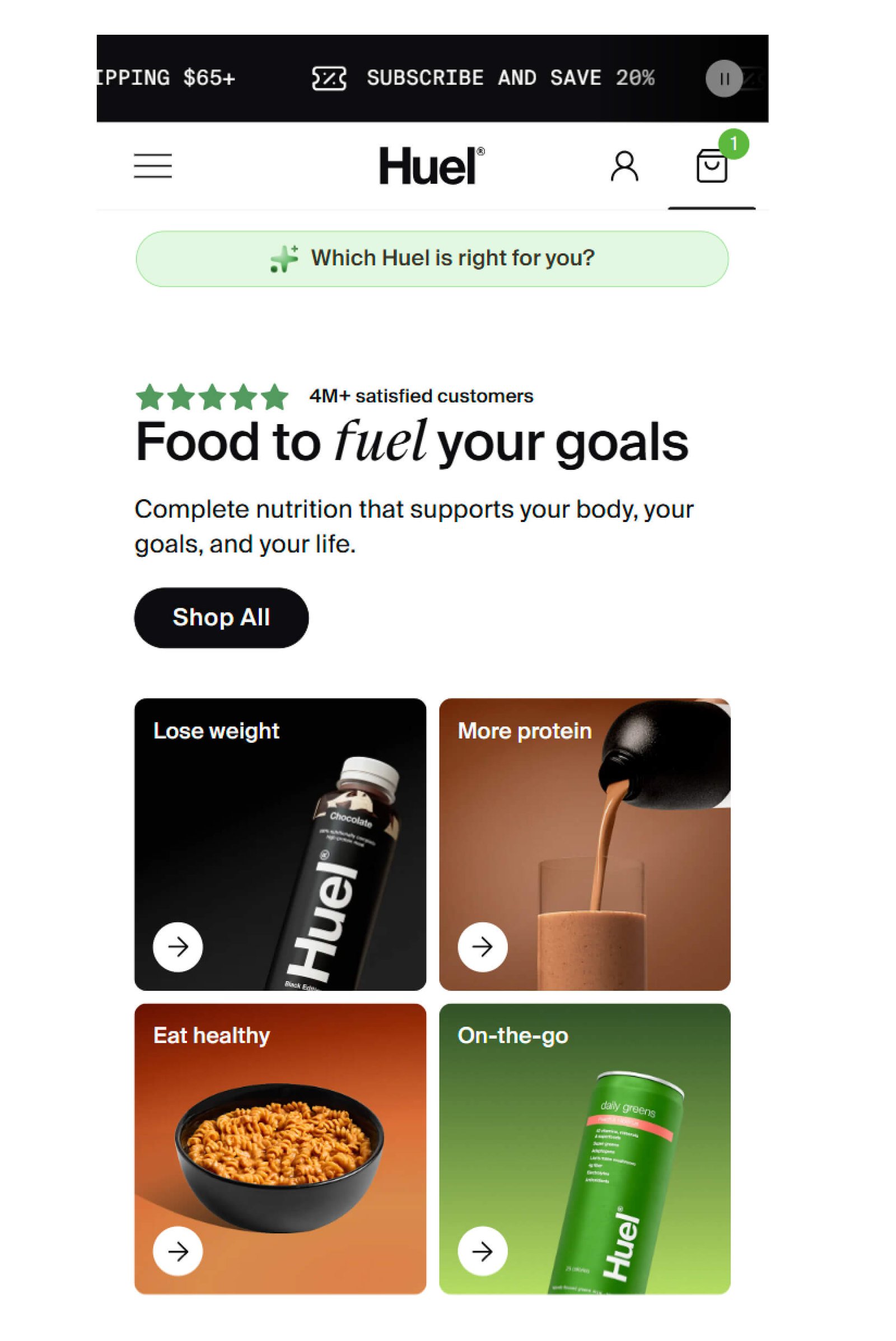
Huel’s homepage opens with a rotating announcement ticker that surfaces four distinct value propositions before the visitor processes a single headline: free shipping over $65, 20% subscription savings, HSA/FSA eligibility, and a 25% referral discount. Each is clickable, each links to a dedicated landing page. The HSA/FSA callout is particularly smart – it positions Huel as a legitimate health expense, not a discretionary supplement purchase. Most DTC nutrition brands don’t surface this, and it’s a conversion lever that removes a real payment objection.
Below the ticker, the hero section leads with “4M+ satisfied customers” above a benefit-driven headline: “Food to fuel your goals.” The headline does something subtle but important – it positions Huel as a means to an end, not a product category. It’s not “complete nutrition powder” or “meal replacement shakes.” It’s food that fuels goals. This matters because Huel competes against traditional meals, protein shakes, supplements, and snack bars simultaneously. The positioning has to be broad enough to capture all those audiences without diluting the message.
Directly below the headline, four goal-based category cards – Lose weight, More protein, Eat healthy, On-the-go – give visitors with a specific need an immediate path to a curated product collection. Compared with most DTC brands in the nutrition category, Huel’s above-the-fold strategy packs an unusual density of trust signals, navigation options, and conversion paths into a single scroll-free view.
The Product Page That Sells for You
Huel’s Black Edition product page, the site’s bestseller, is a conversion engine that layers persuasion elements with unusual precision. The page opens with a benefit-first headline – “High-protein, high in fiber” – above the product imagery, leading with what the customer cares about rather than the product name. Four nutritional stats (40g protein, 27 vitamins and minerals, 11g fiber, gluten-free) sit alongside the hero image, giving data-driven buyers the key numbers at a glance.
The real sophistication is in the purchase form. Huel defaults to the subscription option, which is badged “MOST POPULAR” and shows the per-meal price ($2.65) alongside the one-time price ($3.31). The per-meal reframing is critical – it makes a $45-95 product feel like a $2.65 decision. Three bullet points below the toggle address subscription objections directly: 20% off recurring orders, skip or reschedule anytime, cancel anytime with no fees. This is textbook objection handling placed at the exact moment of decision.
The flavor selection interface is another well-executed element. Ten flavors are displayed as a vertical list with individual images, prices, and add buttons. “BESTSELLER” and “OUR FAVORITE” tags on specific flavors guide undecided customers. A pre-curated Bestseller Trio bundle sits at the top of the list for anyone who’d rather not choose at all. Where Huel, the UK-based complete nutrition brand, differs from typical DTC supplement brands is in how aggressively it reduces decision friction at every step – from pre-selecting the subscription, to flagging popular flavors, to offering a curated bundle as an escape from choice overload.
Cart to Checkout: Where the Real Money Gets Made
Huel’s cart drawer is one of the most feature-dense we’ve analyzed. After adding a product, the drawer slides open with a dual-threshold progress bar showing two incentive milestones: free shipping at $65 and a 10% discount at $120. This gamified approach to AOV optimization gives the customer a visual reason to add more, and the dual threshold is more effective than a single free-shipping bar because it creates two motivation points instead of one.
Below the progress bar, Huel cross-sells short-dated stock at 45% off – a clever inventory management tactic that doubles as a conversion play. The urgency is real (best-before dates are displayed), the discount is substantial, and the products are complementary. Further down, “You’ll love this” suggestions offer subscription add-ons like Energy+ at $8.40.
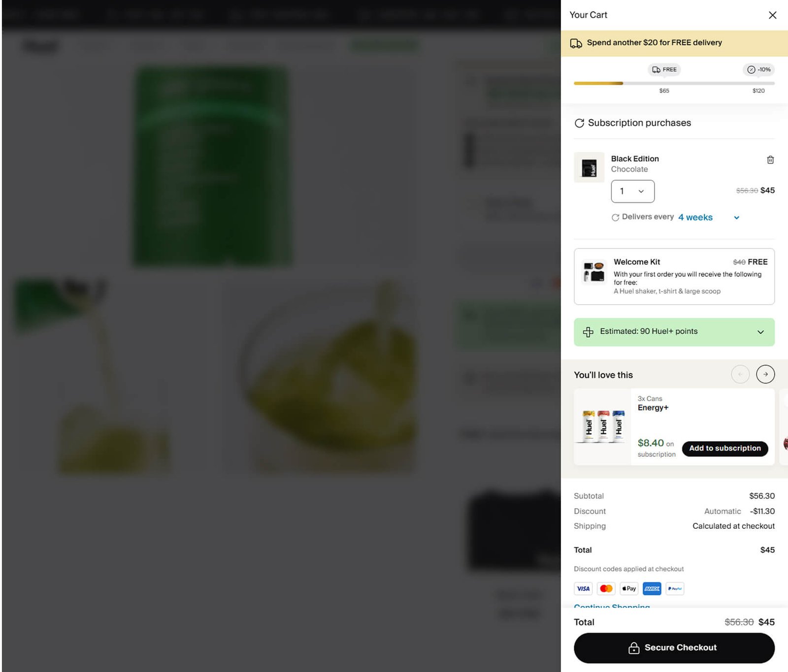
The cart clearly displays subscription details – flavor breakdown, original price crossed out against the discounted total, delivery frequency with an adjustable dropdown, and a free Welcome Kit valued at $40 (shaker, t-shirt, and large scoop) visualized with product images. The Welcome Kit display is a particularly effective tactic for first-time subscribers – showing a physical gift with its retail value creates perceived savings that feel more tangible than a percentage discount.
The strongest part of Huel’s cart experience is how it layers multiple conversion tactics without feeling cluttered. Progress bars, cross-sells, gift visualization, loyalty points, and transparent pricing all coexist in a slide-out panel that still feels organized. Most brands would create friction by cramming this much into a cart drawer, but Huel’s clean design and clear visual hierarchy keep it manageable.
Navigation Architecture: Serving Every Type of Buyer
Huel’s navigation deserves its own section because it solves a problem most multi-product DTC brands struggle with: how to serve both product-aware and problem-aware visitors from the same menu structure.
On desktop, the “Shop all” mega menu opens with three tabs: Shop by Collection (product categories), Shop by Goal (weight loss, protein, healthy eating), and Help me choose (quiz funnel). On mobile, a toggle switches between Collection and Goal views. The Science mega menu links to formula-explanation pages rather than product pages, creating a separate navigation path for detail-oriented buyers. The About dropdown provides comprehensive institutional links.
The mobile hamburger menu goes further by placing a “Refer a Friend” section with a photo and clear value proposition directly in the menu – most brands bury referral programs in the footer. A persistent “Which Huel is right for you?” quiz CTA sits below the header on every page, offering guided discovery for overwhelmed first-time visitors.
Where Huel stands out from most DTC brands is the thoughtfulness of these parallel navigation paths. A returning subscriber who knows they want Black Edition Chocolate can get there in two clicks via the collection path. A new visitor who searched “high protein meal replacement” can browse by goal. Someone who’s curious about the science can explore formulation pages. Someone who’s completely lost can take the quiz. Four user intents, one navigation system.
The Trust Stack: How Huel Layers Credibility Across Every Scroll
Huel’s approach to social proof is aggressive but earned. The homepage stacks multiple trust layers in sequence: 4M+ customers badge, six benefit cards (including the boldly named “No Bullshit”), five science-backed claims with “100+ peer-reviewed studies,” celebrity endorsements from Steven Bartlett, Alex Rodriguez, and Idris Elba, press quotes from Vox, GQ, Wired, and Men’s Health, Target retail availability, a 30-day taste guarantee, and a B-Corp certification badge in the footer.
Each layer serves a different trust dimension. The customer count establishes scale. The science claims establish legitimacy. The celebrity endorsements create aspiration. The press logos provide third-party validation. The Target callout signals mainstream acceptance. The taste guarantee reverses risk. The B-Corp badge appeals to values-driven buyers. Huel uses social proof to achieve more than just credibility – each element strategically targets a different buyer objection or motivation.
On the product page, this trust stack is reinforced and extended with product-specific elements: a detailed FAQ section (with schema markup that feeds AI assistants), ingredient transparency showing real food images, and an “Over 150 health benefits” grid linking specific vitamins to specific outcomes.
What You Can Steal
- Implement dual-mode navigation on your product catalog. Add a “Shop by Goal” or “Shop by Problem” view alongside your standard category navigation. This serves problem-aware visitors who don’t yet know your product taxonomy. Huel’s toggle between Collection and Goal views is the cleanest implementation we’ve seen.
- Default your product pages to subscription with a “MOST POPULAR” badge and visible per-unit savings. Address the three biggest subscription objections (cost, flexibility, lock-in) in bullet points directly below the toggle. Huel’s three-bullet format – 20% off, skip anytime, cancel with no fees – is a template worth adapting.
- Add a dual-threshold progress bar to your cart showing both a free shipping threshold and a secondary incentive (percentage discount, free gift). Two milestones create two motivation points for AOV optimization. Huel’s $65/$120 structure is effective because the second threshold feels achievable after hitting the first.
- If you offer a subscription, visualize the free welcome gift in the cart with its retail value shown. Huel’s “Welcome Kit – $40 FREE” with product images is more persuasive than a text line saying “free shaker included.” Physical gift visualization creates tangible perceived value.
- Build comprehensive FAQ schema markup on your product pages covering the actual questions customers ask. Huel’s 9-question FAQ Page schema on the Black Edition PDP covers everything from protein content to vegan suitability. This structured data feeds both Google featured snippets and AI assistant responses, expanding your discoverability across traditional and AI search.
Where They’re Leaving Money on the Table
- No search on mobile. Huel has 15+ products across six categories and no visible search icon in the mobile header. High-intent returning customers who know exactly what they want are forced to navigate through menus instead of typing a product name. For a brand with this product breadth, adding search to the mobile header is one of the simplest high-impact changes available.
- Duplicate heading tags and schemas are diluting SEO signals. The Next.js rendering outputs both mobile and desktop DOM, creating two H1 tags, doubled H2s, and duplicate WebSite schemas on every page. This is a technical fix – conditional rendering or CSS-only hiding instead of full DOM duplication would resolve it without changing the user experience.
- The homepage is missing an og:image tag. When anyone shares huel.com on LinkedIn, Slack, or iMessage, there’s no preview image. For a brand that invests heavily in visual identity, this is a missed branding opportunity on every social share.
- Huel+ loyalty points are displayed without monetary context. “Estimated: 190 Huel+ points” in the cart means nothing to a new customer. Translating points to dollar value (“That’s $X toward your next order”) would make the loyalty program an active conversion motivator rather than a passive badge.
Final Verdict
Huel has built one of the most thoughtfully engineered website funnels in DTC nutrition. The headless Shopify architecture gives them a speed and UX advantage over theme-based competitors. The dual-mode navigation elegantly solves the multi-audience problem. The subscription-first product pages stack nudges without feeling manipulative. The cart drawer packs more conversion intelligence into a slide-out panel than most brands fit into an entire checkout flow. And the trust stack – from 4M customers to B-Corp certification – is both broad and deep.
The biggest single improvement Huel could make is fixing their technical SEO foundation. Duplicate heading tags, duplicate schemas, and a missing og:image are all symptoms of the same issue – their Next.js rendering pipeline isn’t accounting for how search engines and AI systems parse the DOM. These are fixable problems that, once resolved, would unlock significantly more organic and AI-driven traffic for a site that already has strong content and authority signals.